
The State of Architecture: Identity
BRAND DESIGN • COMMUNICATIONS
How does one create an adaptable graphic system for an expansive programme of exhibitions and events?
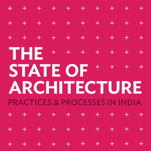
The State of Architecture: Practices and Processes in India organised by the Urban Design Research Insitute in Mumbai was envisaged as a thought-provoking programme of activities to investigate and instigate the concerns of the architectural fraternity in India. As the graphics and exhibition designers for the project, we were tasked with developing a visual identity that would represent the brand within the lead project, and outside of it.
We created a simple typographic identity for the project, building a graphic system around the '+' symbol. An homage to the grid, the field of
plus signs represents the graphs of orthogonal construction, designating space and identifying locations while simultaneously hinting at the insterstitial displacement of contemporary architectural practice.
The minimal forms of the graphic identity were underpinned by vibrant colour, serving to highlight particular thoughts, but also bring coherence to divergent notions, providing an instantly recognizable colour palette for the promotions and communication materials.